Case Study: Digital Report + Data Visualization + Interactive Map
Evaluating Priorities Digital Report
This interactive digital report for Ibis Reproductive Health and the Center for Reproductive Rights, transforms years of research and data comparing supportive and restrictive policy within women’s healthcare into a clear and compelling narrative of women’s health is prioritized throughout the country.

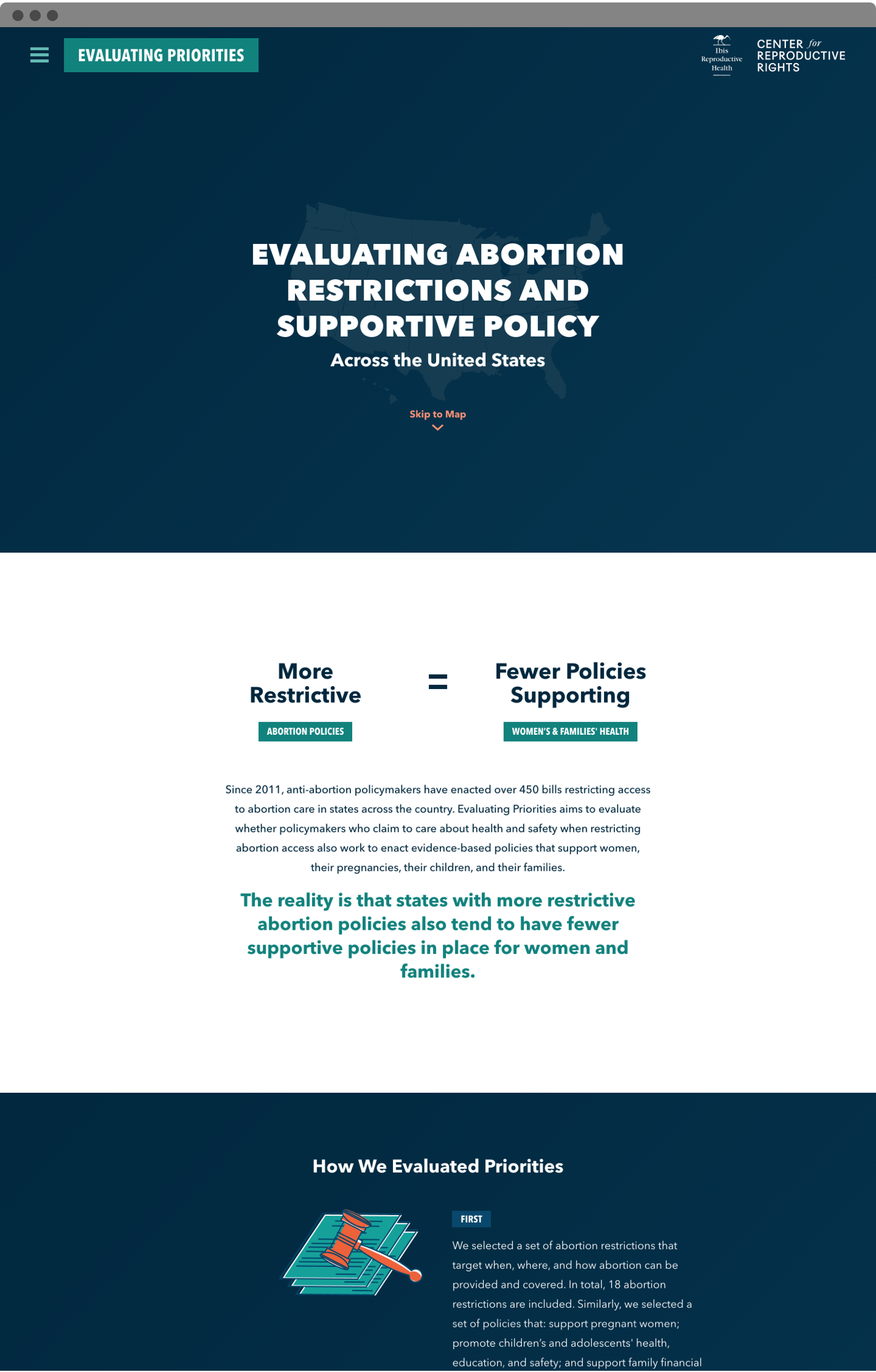
This digital report, interactive map, and data visualization transform two years of research by Ibis Reproductive Health and the Center for Reproductive Rights into an engaging tool that tells the powerful story of how policy impacts women's lives in every state.
Challenge
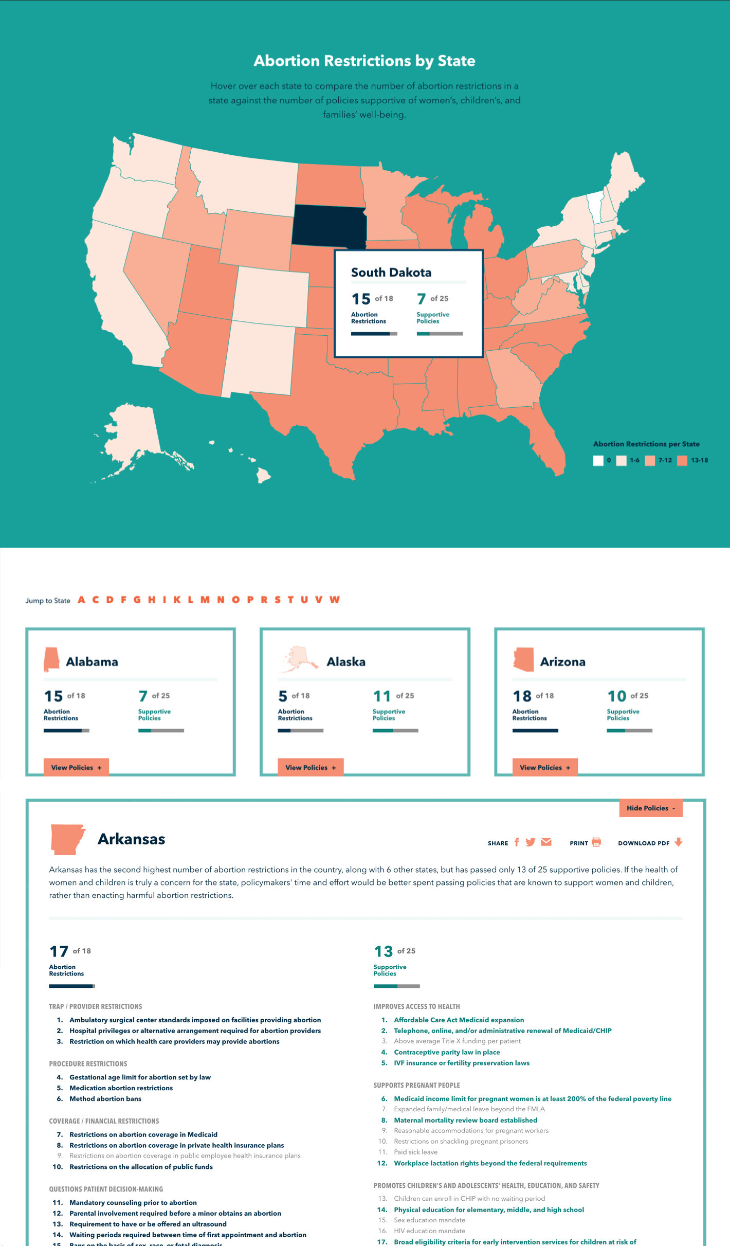
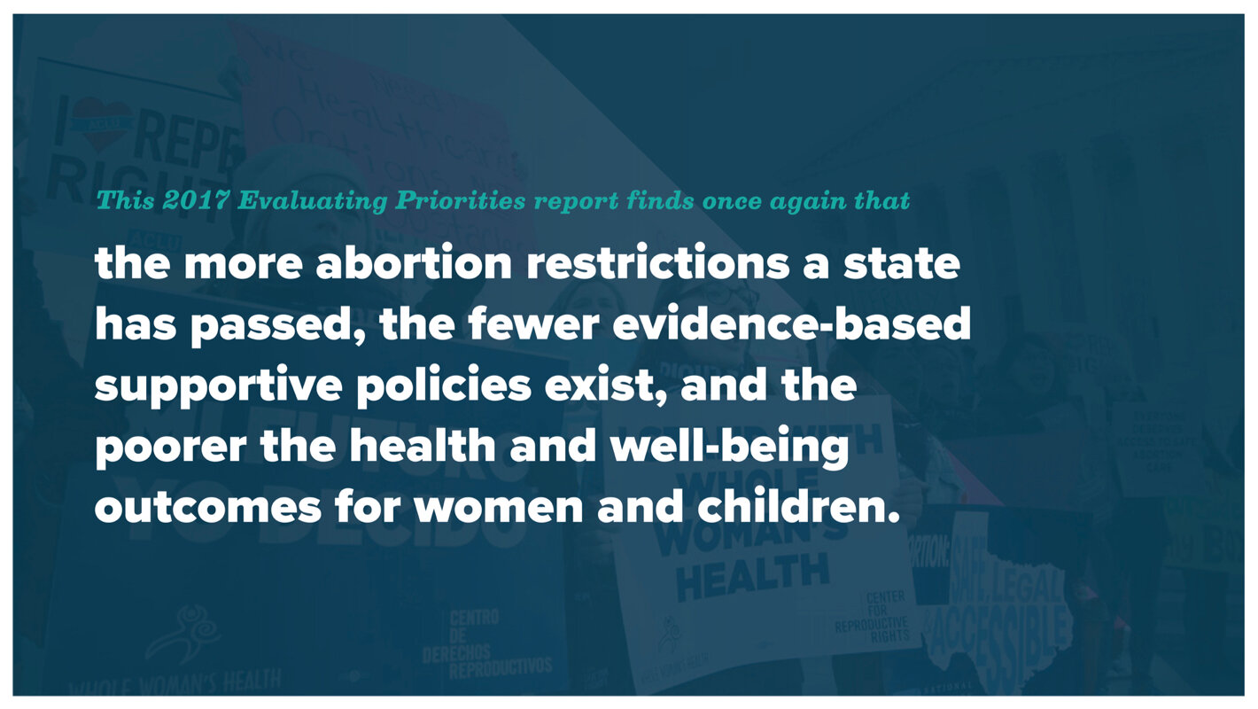
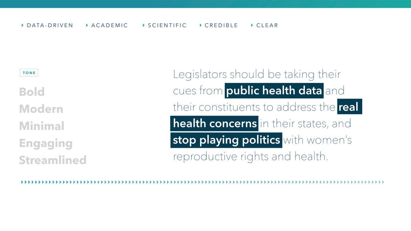
For data to connect with people, it requires a compelling visualization to give it meaning. Without the ability to work in stories to create meaningful connections, this interactive map needed to transform dry analyses into a streamlined, friendly experience showing the correlation between supportive policies in women’s health and fewer abortion restrictions. The end product is a quick and impactful narrative for journalists, lawmakers, and everyday people to efficiently digest, share and download.
Role
Discovery Lead
User Experience Design Lead
Visual Design Lead
Interaction Design
QA
ThinkShout Team
1 Strategist
2 Developers
1 Producer
1 Designer
Key Features
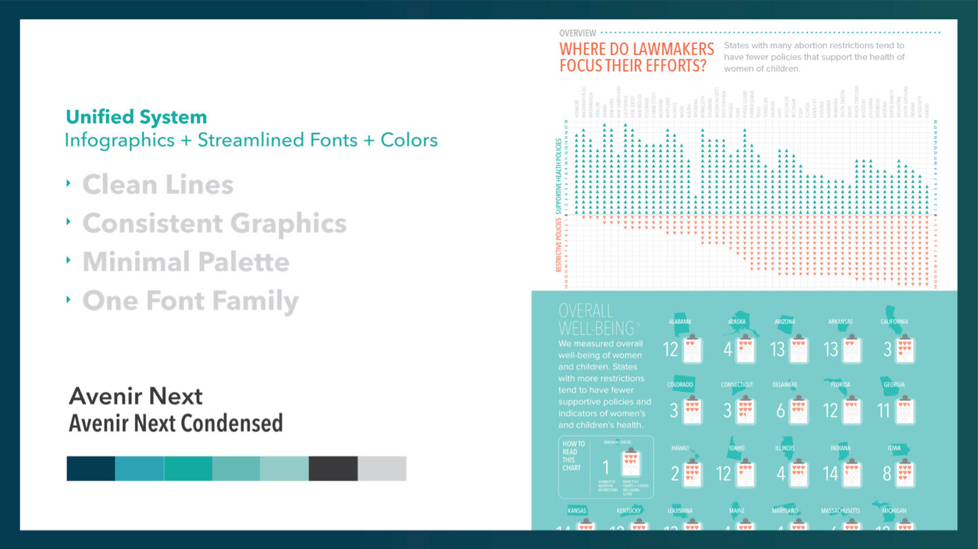
Data Visualization
Interactive Map
Custom Illustration
Map data endpoints powered by real-time database
Downloads of all content available in multiple formats


Discovery: Research + Onsite
Reaching Audiences through Common Ground
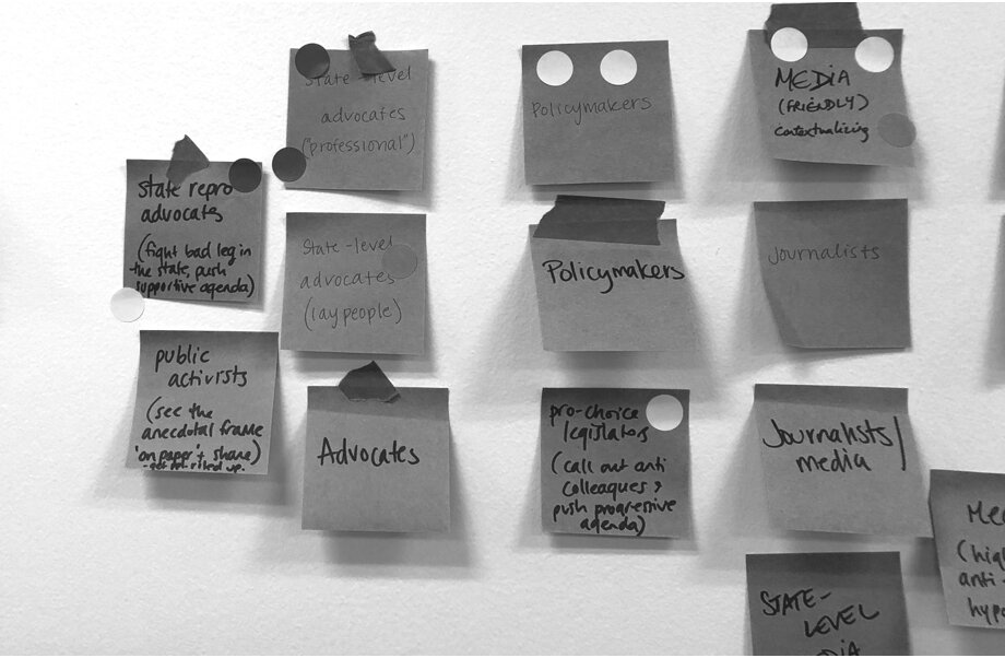
Coming together from around the country meant the Ibis, the Center, and the Thinkshout teams could create a collective understanding of who we were reaching and how they would use this valuable set of data. We ran a workshop to dig into what problems we needed to solve and what was at the heart of the story we were going to tell
Process
Collaborative Workshop
Audience Maps
Surveys + Interviews
User Flows


Visual Design: Creative Direction
A friendly aesthetic that informs an illustrative approach
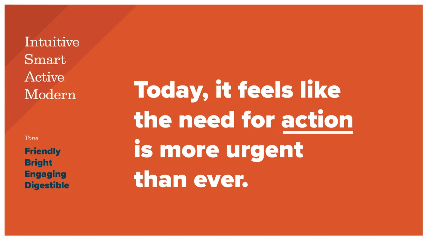
Because this product is a collaboration, the brand could stand on its own. Our team had an opportunity to get creative and create a bold but friendly design strategy that would inform a holistic vision, from data visualization to custom illustration.
User Experience: Wireframes
Creating streamlined structures that encourage interaction
Users can click on their state or the corresponding card to see policies that support or restrict womens’ healthcare. The clean user experience is mobile-first and is easy to consume on any device.

Visual Design
A friendly, accessible interactive experience
This project's result transforms an academic report that only researchers and policymakers would likely understand into a digestible and engaging experience for the journalists, lawmakers, and the public alike.